
import pandas as pd

df = pd.read_csv("resources/MINORS_examination_duration.csv")

df.head()| P_ID | duration | |
|---|---|---|
| 0 | 1_0 | 16.217771 |
| 1 | 1_1 | 16.527785 |
| 2 | 1_2 | 13.318456 |
| 3 | 1_3 | 16.115894 |
| 4 | 1_4 | 15.033374 |
Many thanks to Richard Pilbery for directing me to this excellent package!
Going beyond using some standard distributions that tend to fit certain things well, such as
and using the relevant averages (and, where relevant, spread metrics) from our real-world data to parameterise them, we can go a step further and look to use a distribution with a different shape that reflects our real-world data even more exactly.
We will make use of the fitter package in this section.
If you do not already have fitter, run
pip install fitterFitter provides helper functions to find the most appropriate distribution for your real-world data, and then return the distribution and all relevant parameters.
Let’s start with a sample csv of historical activity times.
Here, we have a dataframe with the historical duration of a particular step of a process - the duration of a nurse appointment.
import pandas as pd
df = pd.read_csv("resources/MINORS_examination_duration.csv")
df.head()| P_ID | duration | |
|---|---|---|
| 0 | 1_0 | 16.217771 |
| 1 | 1_1 | 16.527785 |
| 2 | 1_2 | 13.318456 |
| 3 | 1_3 | 16.115894 |
| 4 | 1_4 | 15.033374 |
Let’s visualise it to begin with.
import plotly.express as px

px.histogram(df["duration"].round(1))
This looks like it might be a normal distribution - a bell-shaped curve with roughly equal tails either side. But what parameters do we need? And is it definitely a normal?
Always think hard about the kind of things you are choosing to work out the distributions for.
You probably want to randomly sample from distributions for your activity durations and your inter-arrival times - but you probably don’t want to be looking at historical distributions of waits as this should emerge from the way your simulation is set up - such as the number of resources and the probabilities of people undertaking different activitities - rather than being informed from historical data, which often also has the problem of reflecting activity rather than pure demand!
By default, fitter will scan all of the distributions provided by the scipy library.
This can lead to you being recommended some fairly unusual - and perhaps less appropriate - distributions.
Instead, we would recommend limiting fitter to a core set of distributions.
distributions_to_scan = [
            "poisson",
            "bernoulli",
            "triang",
            "erlang",
            "weibull_min",
            "expon_weib",
            "betabinom",
            "pearson3",
            "cauchy",
            "chi2",
            "expon",
            "exponpow",
            "gamma",
            "lognorm",
            "norm",
            "powerlaw",
            "rayleigh",
            "uniform"
]Later on we talk about the package sim-tools as an alternative to the scipy library for managing our distributions.
In this case, you’d want to pass in a list of the distributions supported by sim-tools instead.
This list can be found here.
from fitter import Fitter

f = Fitter(df["duration"], distributions=distributions_to_scan, timeout=60)

f.fit()
The summary method gives us an output showing several possible distributions and how well they fit.
Here, gamma, erlang, lognorm, pearson3 and norm all appear to approximate this data very well - with a gamma distribution being the best fit, though there is very little in it.
nurse_appt_duration_fit = f.summary()

nurse_appt_duration_fit| sumsquare_error | aic | bic | kl_div | ks_statistic | ks_pvalue | |
|---|---|---|---|---|---|---|
| gamma | 0.003110 | 854.790795 | 875.703235 | inf | 0.004345 | 0.998265 |
| erlang | 0.003110 | 854.792833 | 875.705273 | inf | 0.004342 | 0.998284 |
| lognorm | 0.003110 | 854.803534 | 875.715974 | inf | 0.004365 | 0.998137 |
| pearson3 | 0.003110 | 854.790946 | 875.703386 | inf | 0.004371 | 0.998098 |
| norm | 0.003112 | 853.003887 | 866.945513 | inf | 0.004655 | 0.995350 |
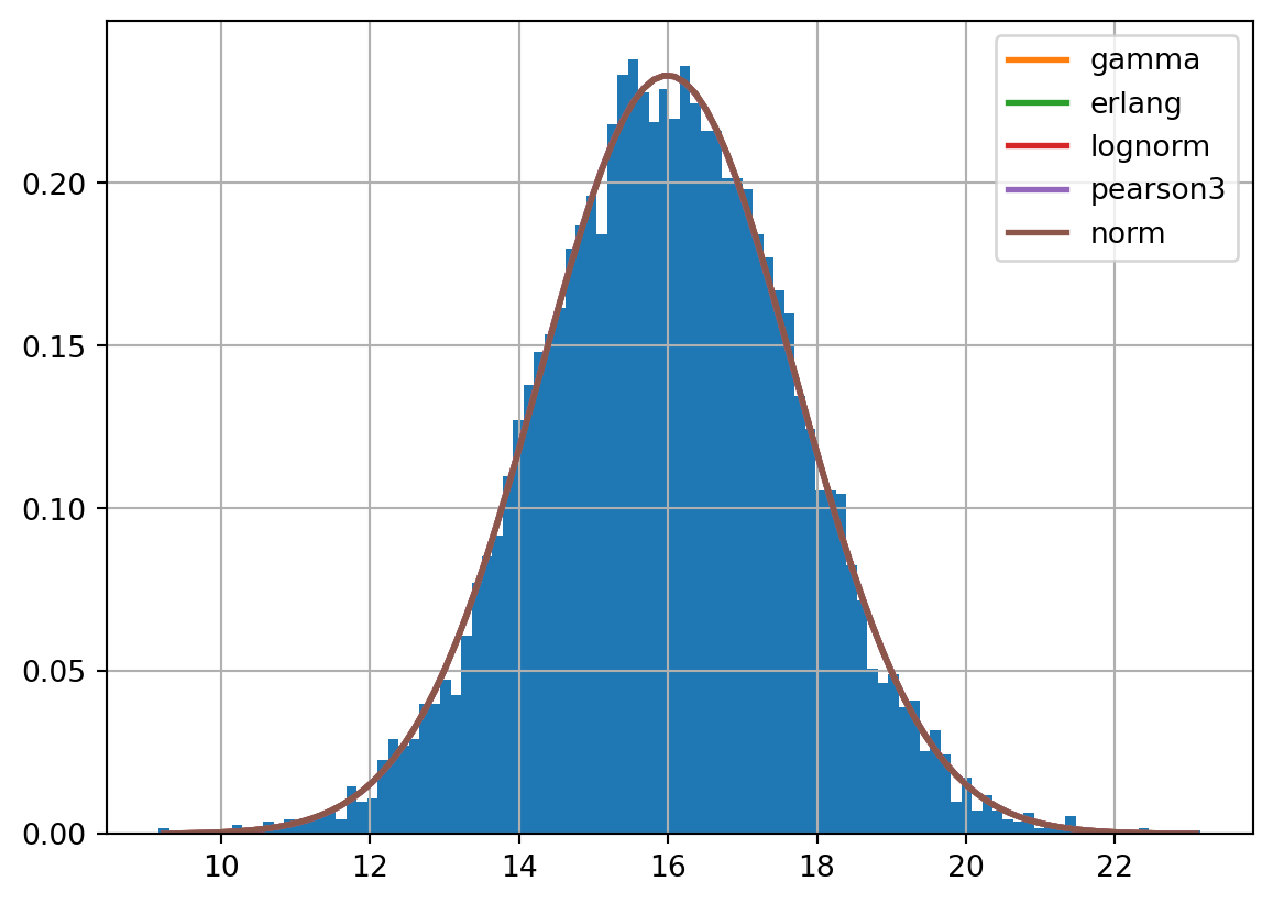
Each of these columns is a measure of the fit, with some of the measures also penalising overly complex distributions.
Smaller = better: sumsquare_error, aic, bic, ks_statistic
Larger = better: ks_pvalue
Let’s now just pull out the details of the best fitting distribution.
This returns a dictionary containing the parameter values we need to be able to set up the distribution using one of the python libraries for distributions.
nurse_appt_duration_fit = f.get_best()

nurse_appt_duration_fit
{'gamma': {'a': 148119.25230778163,
'loc': -642.781546778717,
'scale': 0.004447598384144486}}We can then use these parmeters to set up and sample from a gamma distribution.
The random library doesn’t actually have a gamma distribution!
random also has limitations when it comes to making your simulations reproducible and reducing variance across runs when comparing scenario - which are things we will talk about more in a later chapter on reproducibility.
For these reasons, instead of using the random package, we will instead use scipy’s distributions.
from scipy.stats import gamma

# Example: generate one random sample
sample = gamma.rvs(
  a=nurse_appt_duration_fit['gamma']["a"],
  loc=nurse_appt_duration_fit['gamma']["loc"],
  scale=nurse_appt_duration_fit['gamma']["scale"]
  )

sample14.289062901286684Alternatively we can write something like this:
def gamma_duration():
    return gamma.rvs(
        a=nurse_appt_duration_fit['gamma']["a"],
        loc=nurse_appt_duration_fit['gamma']["loc"],
        scale=nurse_appt_duration_fit['gamma']["scale"]
        )
Then, each time we need a duration, we just run:
gamma_duration()14.190640693195519Instead, you could consider using the sim-tools package, which has several additional helpers for managing distributions and randomness.
You can find more out about sim-tools here.
To use sim-tools, you will first need to run
pip install sim-toolsNote that there’s a hyphen in the package name, but we must use an underscore instead when importing it!
from sim_tools.distributions import Gamma

# Define a distribution
my_gamma = Gamma(
  alpha=nurse_appt_duration_fit['gamma']["a"],
  location=nurse_appt_duration_fit['gamma']["loc"],
  beta=nurse_appt_duration_fit['gamma']["scale"], # Note that sim-tools calls the the 'scale' parameter 'beta'
  random_seed=42
  )

# Get a random sample
sample = my_gamma.sample()

sample16.513643626815565In a full simulation, we may set up the distribution for each activity time, inter-arrival time, and other decision points in the __init__ method of our Model class.
Each time we need to sample, we can then just call the .sample() method - and because of the setup of the random seed, we will get reproducible results.
That’s the gist of it - we cover this in more detail in the reproducibility chapter, or you can look at the DistributionRegistry class in SimTools for an even more robust way of managing this.
Let’s prove all three produce something similar!
# Generate samples from each method
# We'll use len(df["duration"]) to generate as many samples as we have in our real (historical) dataset
samples_scipy = [gamma_duration() for _ in range(len(df["duration"]))]
samples_simtools = [my_gamma.sample() for _ in range(len(df["duration"]))]import plotly.graph_objects as go
fig = go.Figure()
# Real data histogram
fig.add_trace(go.Histogram(
x=df["duration"], # Our 'real' data
nbinsx=50,
name='Historical Data',
opacity=0.3,
marker_color='green'
))
# Scipy samples histogram
fig.add_trace(go.Histogram(
x=samples_scipy,
nbinsx=50,
name='scipy.stats.gamma Samples',
opacity=0.3,
marker_color='blue'
))
# sim_tools samples histogram
fig.add_trace(go.Histogram(
x=samples_simtools,
nbinsx=50,
name='sim_tools Gamma Samples',
opacity=0.3,
marker_color='red'
))
# Overlay histograms
fig.update_layout(
barmode='overlay',
title_text='Comparison of Sample Distributions',
xaxis_title_text='Duration',
yaxis_title_text='Count',
legend_title_text='Data Source'
)
fig.show()from scipy.stats import gaussian_kde
import numpy as np
# --- Create density estimations ---
# Use scipy's gaussian_kde for smooth density curves
real_data = df["duration"].copy()
kde_real = gaussian_kde(real_data)
kde_scipy = gaussian_kde(samples_scipy)
kde_simtools = gaussian_kde(samples_simtools)
# Define a common x-axis range (based on min/max of all data)
xmin = min(real_data.min(), min(samples_scipy), min(samples_simtools))
xmax = max(real_data.max(), max(samples_scipy), max(samples_simtools))
x_values = np.linspace(xmin, xmax, 500)
# --- Create plot ---
fig = go.Figure()
fig.add_trace(go.Scatter(
x=x_values,
y=kde_real(x_values),
mode='lines',
name='Historical Data',
line=dict(color='green')
))
fig.add_trace(go.Scatter(
x=x_values,
y=kde_scipy(x_values),
mode='lines',
name='scipy.stats.gamma Samples',
line=dict(color='blue')
))
fig.add_trace(go.Scatter(
x=x_values,
y=kde_simtools(x_values),
mode='lines',
name='sim_tools Gamma Samples',
line=dict(color='red')
))
# Layout
fig.update_layout(
title='Density Plot Comparison of Real and Simulated Data',
xaxis_title='Duration',
yaxis_title='Density',
legend_title_text='Source'
)
fig.show()Here we’ve demonstrated some libraries that can help make sure your simulation’s distributions accurately reflect real-world data.
You could now try repeating this process for every different activity time in your data, as well as things such as inter-arrival times - and see how much difference it makes compared to using the Exponential and Lognormal distributions we’ve used so far in the book.